AP Forecast Dashboard
Corporate Finance Excel Template (Free Download)
Track vendor payment timing across 12 months with weighted DPO, peak AP balance, AP intensity, closing AP, annual purchases and payments, and the distribution of cash paid in each timing bucket.



professionals from Deloitte
Used by professionals from






About this dashboard
The AP Forecast dashboard turns a monthly purchases plan into a clear view of vendor cash timing. It surfaces weighted-average DPO, peak AP balance and the month it occurs, AP intensity at peak, closing AP at M12, annual purchases, and annual payments. DPO and AP intensity carry traffic-light status against user-set thresholds.
Supporting workbook schedules provide the vendor-level terms and annual spend view, a 12x12 payment matrix, a post-period spill column, and a monthly AP roll-forward. Those schedules explain how purchases become payments and how opening AP, purchases, and payments produce closing AP; the dashboard presents the resulting operating metrics.
Use the dashboard to read cash-out timing for treasury, understand vendor financing held in AP, and assess terms changes through their effect on DPO and peak balance. Payment timing is grouped into same-month, plus-one, plus-two, and plus-three-month buckets, giving a practical view of when planned purchases leave cash.
What every dashboard includes
Live formulas, no hardcoded values
Outputs are driven by live formulas, so the workbook updates from its assumptions instead of relying on hardcoded results.
All assumptions in one tab
Inputs are clearly marked in the Assumptions tab and separated from calculations, making it clear what to change and what to leave intact.
Statements always balancing
For integrated-statement models, the balance sheet, cash flow, and supporting schedules tie through properly.
Distinct schedules for clarity
Debt, working capital, taxes, and cash flow can get messy quickly. We group calculations in clear schedules, not across disconnected tabs.
No hidden macros or external links
There are no unexplained external workbook links or macros to undermine auditability or portability.
Changes flow through the model
Update a key driver and see the impact carry through the forecast, financing, and return outputs. We never use hardcoded numbers in formulas.
What's inside the AP Forecast Dashboard
- Weighted-average DPO across the vendor panel
- Peak AP balance and peak month
- AP intensity at peak purchases
- Closing AP balance at M12
- Annual purchases and annual payments
- Payment timing distribution with DPO and AP-intensity status
Formatted to IB standards
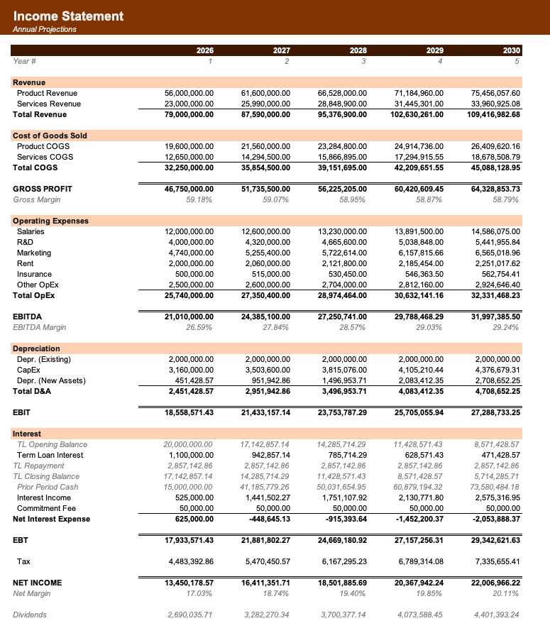
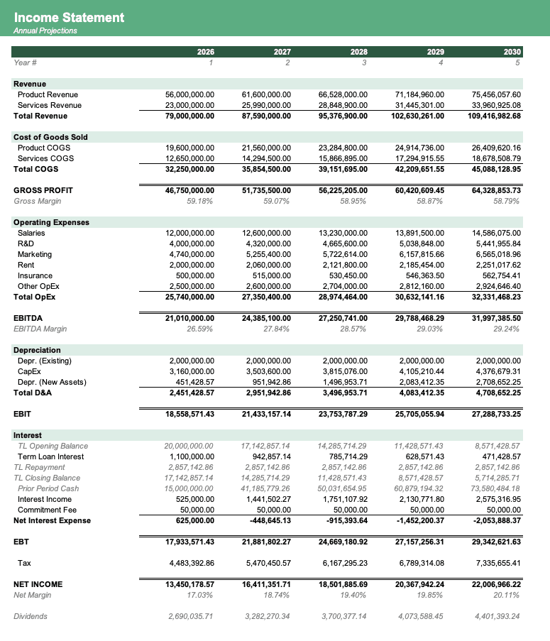
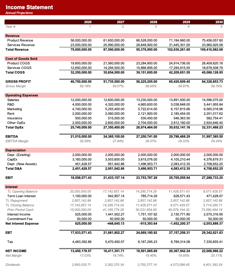
Named theme colors repaint the whole workbook in one click, on top of an investment-banking structure with clear input, output, and cross-sheet reference styling - brand-ready, institutional-grade, and fully auditable.

Created by ex-finance professionals
Hey, I’m Alex and I created Finamodel.
Over my years in the finance industry I kept building the same models over and over again. Same structure, same assumptions, different logo. So I started building frameworks to turn them into clean, reusable templates.
Every model here is one I’d actually use for a client, and I personally vet each one before it goes up.
I’m not an expert in every industry, but I’ve built enough models to know what belongs in one. And when something is completely foreign to me, I reach out to my network for experts to work on our models with us.
Having a template library on hand cuts a first build from hours to minutes.
Need help finding your model? You’ll find me in the Finamodel app!
Frequently asked
What does the AP Forecast dashboard show?+
It shows weighted-average DPO, peak AP balance and its month, AP intensity at peak, closing AP at M12, annual purchases, annual payments, and the distribution of payments across timing buckets. Traffic-light indicators compare DPO and AP intensity with the thresholds set for the forecast.
How should I read weighted DPO?+
Weighted DPO reflects the vendor panel’s annual-spend mix. Each vendor’s terms days receive weight according to that vendor’s share of annual purchases, so larger vendors influence the headline more than smaller vendors. It describes the panel’s cash-timing centre of gravity.
What is AP intensity at peak?+
AP intensity at peak divides the highest AP balance by monthly purchases in that period. It indicates how many months of purchases are represented by the largest payable balance, helping users assess the amount of vendor financing carried during the forecast window.
Why can payments extend beyond M12?+
Purchases made late in the forecast may be paid one, two, or three months later under the bucket timing approach. The supporting payment schedule records that deferred amount in a post-period spill column, while the dashboard keeps the timing distribution visible for the annual plan.
Can this dashboard replace a cash flow forecast?+
The dashboard focuses on accounts payable and vendor cash timing. Its payment outputs can inform a broader cash flow, runway, or three-statement forecast, but it does not present receivables, operating expenses, financing flows, or the other schedules required for a complete cash forecast.
Have more financial modelling questions? Contact us
Related dashboards
Financial Health Dashboard
12-month liquidity, solvency, profitability, and efficiency ratio dashboard.
Board Reporting Pack Dashboard
A board KPI dashboard with 24-month trends, MoM and YoY changes, YTD comparisons, and a one-page reporting summary.
Cash Flow Dashboard
Monitor receipts, payments, debt service, and closing cash for practical weekly or monthly liquidity planning.
Income Statement Dashboard
Headline revenue, profit, margin, workforce productivity, revenue mix, and earnings bridge metrics for a five-year income statement.