Financial Health Dashboard
Corporate Finance Financial Model (Free Excel Download)
Diagnose profitability, liquidity, leverage, cash conversion, and growth efficiency through practical financial ratios and trend-based management outputs.



professionals from Deloitte
Used by professionals from






About this model
A financial-health dashboard ties a 12-month operating P&L and a parallel balance-sheet roll-forward to fifteen ratios across the four canonical financial-health families - liquidity (current, quick, cash), solvency (debt-to-equity, debt-to-assets, equity ratio, interest coverage), profitability (gross margin, EBITDA margin, net margin, ROA, ROE), and efficiency (asset turnover, inventory turnover, DSO). The workbook is organised around an Assumptions sheet that holds every driver as a named range, an Income_Statement sheet that compounds month-1 revenue at a monthly growth rate and applies ratio-based COGS, opex, depreciation, interest, and tax, a Balance_Sheet sheet that runs a working-capital and capital-plan roll-forward, a Ratios sheet that translates the IS and BS into fifteen rows across twelve months, and a Dashboard sheet that summarises every ratio with latest, 12-month average, green and amber thresholds, a status string, and an industry benchmark.
The balance sheet is self-balancing: cash is computed as the plug that ties total assets to total liabilities plus equity, so the balance-check row resolves to zero in every period without manual cash-line maintenance. Working capital is driven by DSO / DIO / DPO and accrued-expense days applied to the relevant P&L flow line, PP&E rolls forward with a constant monthly capex and a depreciation rate applied to prior-month PP&E, long-term debt amortises at a constant monthly figure, and equity grows with retained earnings net of dividends. Annualised ratios (ROA, ROE, asset turnover, inventory turnover) multiply the monthly numerator by 12 before dividing by the period balance so the figures read on a comparable annual basis. Direction-aware status logic flips the comparator on a per-ratio direction code so 'Healthy' triggers correctly for both 'higher is better' ratios (liquidity, profitability, coverage) and 'lower is better' ratios (leverage, DSO).
CFOs, FP&A teams, controllers, and lenders use the template for monthly close reviews, covenant monitoring, and board KPI packs - anywhere the question is 'how does the business actually look at a glance against industry-standard ratio bands?' Each Dashboard row carries a benchmark band (current ratio 1.5-3.0x, EBITDA margin 15%+, debt-to-equity 0.3-1.5x, interest coverage 3.0x+, DSO 30-60 days) so the reader can sanity-check the threshold inputs at a glance and recalibrate the green / amber bands to match the operating context.
What every model includes
Live formulas, no hardcoded values
Outputs are driven by live formulas, so the workbook updates from its assumptions instead of relying on hardcoded results.
All assumptions in one tab
Inputs are clearly marked in the Assumptions tab and separated from calculations, making it clear what to change and what to leave intact.
Statements always balancing
For integrated-statement models, the balance sheet, cash flow, and supporting schedules tie through properly.
Distinct schedules for clarity
Debt, working capital, taxes, and cash flow can get messy quickly. We group calculations in clear schedules, not across disconnected tabs.
No hidden macros or external links
There are no unexplained external workbook links or macros to undermine auditability or portability.
Changes flow through the model
Update a key driver and see the impact carry through the forecast, financing, and return outputs. We never use hardcoded numbers in formulas.
What's inside the Financial Health Dashboard
- Assumptions sheet with named-range P&L drivers, opening BS, working-capital days, capital plan, and per-ratio thresholds
- 12-month Income Statement: revenue, COGS, gross profit, opex, EBITDA, depreciation, EBIT, interest, EBT, tax, net income
- 12-month Balance Sheet with cash as the plug that ties total assets to liabilities plus equity, with a balance-check row that resolves to zero
- Ratios sheet with 15 ratios across four families: liquidity (3), solvency (4), profitability (5), efficiency (3)
- Direction-aware traffic-light logic so leverage ratios trigger correctly when higher is worse
- Dashboard with latest, 12-month average, green and amber thresholds, status string, and industry benchmark per ratio
How the Financial Health Dashboard works
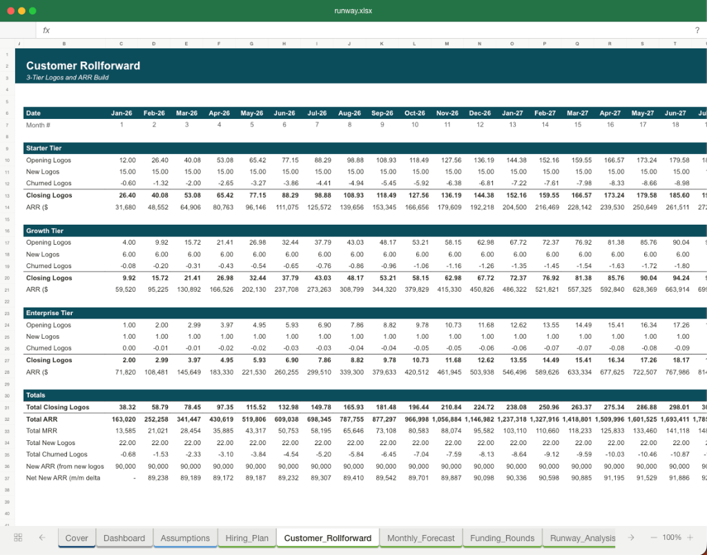
The financial health dashboard template builds a 12-month view of business performance by linking a compact operating P&L, a self-balancing balance sheet and an indirect cash flow statement. It computes fifteen ratios across liquidity, solvency, profitability and efficiency, then condenses them into a composite score, Altman Z and Piotroski F readouts so readers can assess the simulated company's condition.
Revenue, Costs and the Operating Bridge
The operating model starts from a revenue base that compounds at a chosen growth rate, with segment splits shown for reporting. Cost of goods sold and operating expenses are driven off revenue by percentage assumptions.
- EBITDA is gross profit less operating expenses. Depreciation is charged against the prior month's net PP&E rather than the current closing balance, which avoids double-counting the same month's capex.
- Interest is calculated on the opening debt balance. The resulting EBIT and interest feed earnings before tax, and a net operating loss roll tracks opening losses, losses used and closing balances so tax is applied only to taxable positive earnings.
Self-Balancing Balance Sheet and Cash Flow
The balance sheet builds each line from operating drivers rather than plugs. Receivables, inventory, payables and accruals are calculated from revenue or cost flows multiplied by days assumptions divided by thirty.
- PP&E rolls forward with capex added and depreciation deducted, long-term debt amortises monthly, and equity rolls from opening equity plus retained earnings. Cash on the balance sheet is not typed in; it comes from the closing cash line of the indirect cash flow statement.
- That statement computes cash from operations as net income plus depreciation and amortisation, less changes in receivables and inventory, plus changes in payables and accruals. Investing and financing sections subtract capex, debt amortisation and dividends.
The sum of the three sections equals the change in cash, so the balance sheet balances by construction.
Ratio Families and Composite Scoring
Twenty-six ratios are grouped into liquidity, solvency, profitability and efficiency blocks. Liquidity covers current, quick and cash ratios plus operating cash flow ratio and working capital ratio.
- Solvency includes debt-to-equity, debt-to-assets, equity ratio, interest coverage on EBIT and EBITDA, debt service coverage, fixed charge coverage and net debt to EBITDA. Profitability includes gross, EBITDA, net and free cash flow margins plus ROA and ROE using two-month average balances.
- Efficiency covers asset, inventory, receivable, payable turnovers, capex intensity and reinvestment rate. Each ratio is evaluated against green, amber and red threshold bands.
- Bounded ratios fail both when too low and too high, so excess cash or under-leverage is flagged. Family sub-scores average 100, 60 or 20 for healthy, watch and off-track statuses, and a weighted composite lands between zero and 100.
Altman Z and a nine-criterion Piotroski F score sit alongside as distress indicators.
Dashboard, Benchmarks and Practical Use
The one-page dashboard displays each ratio with its latest value, twelve-month average, trend arrow, period-over-period change, status and benchmark comparison. An industry selector loads sector-specific benchmark mid-points per ratio through a lookup.
- A peer median is also shown for six common comparables. Scenario toggles for base, bull and bear flip eight operational inputs at once, allowing comparison of health under different conditions.
- The model includes a checks sheet with fourteen invariants such as balance sheet balancing, positive cash, interest coverage above EBITDA and composite scores within range. Sensitivity grids show how the composite proxy responds to revenue growth against COGS percentage, and how month-twelve cash varies with DSO against DPO.
Together these outputs give a structured read on the simulated business.
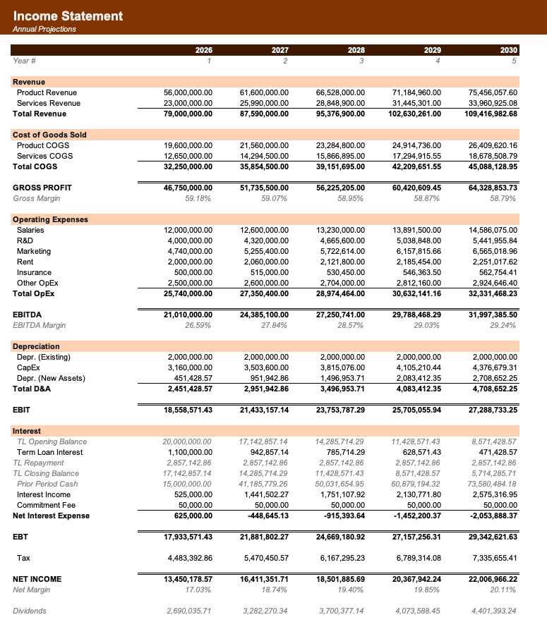
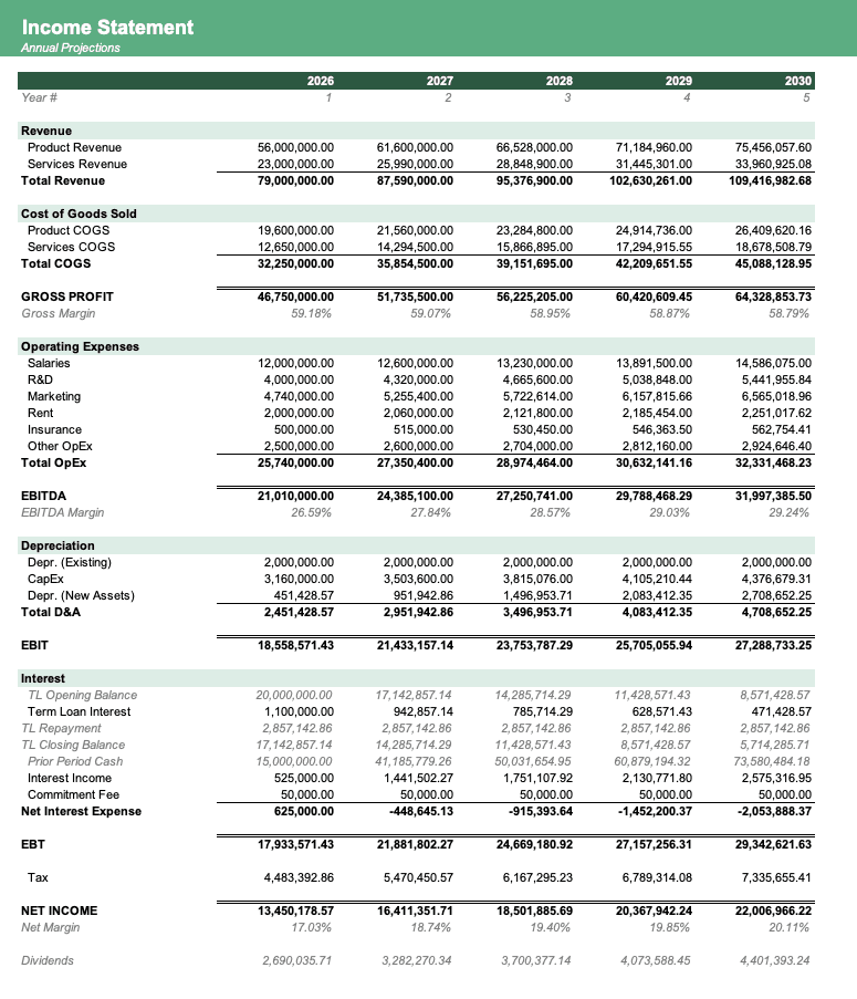
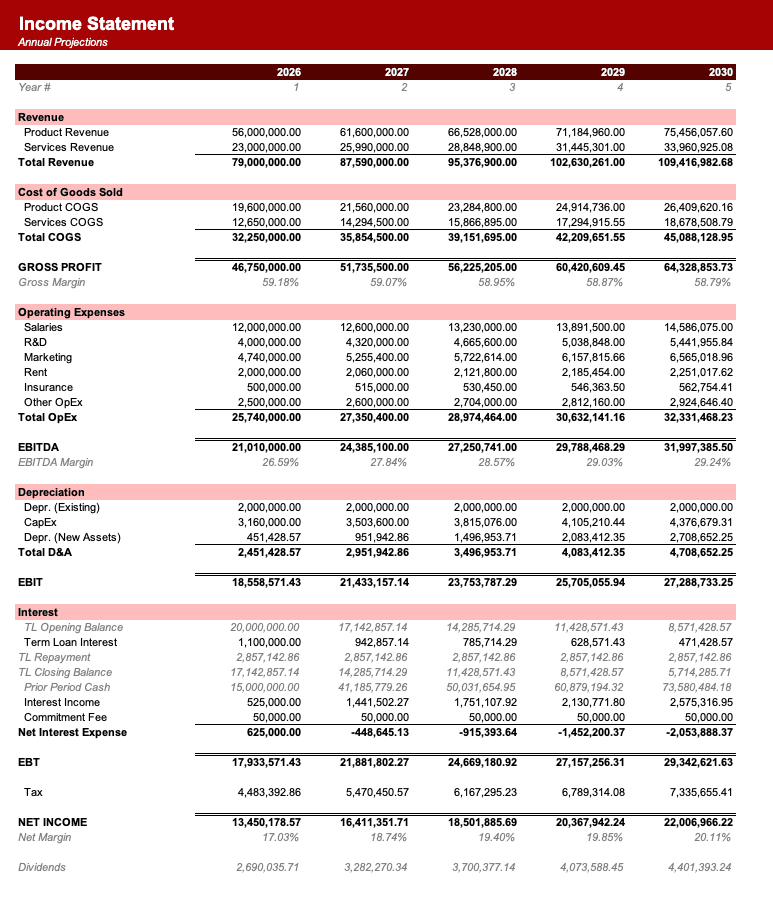
Formatted to IB standards
Named theme colors repaint the whole workbook in one click, on top of an investment-banking structure with clear input, output, and cross-sheet reference styling - brand-ready, institutional-grade, and fully auditable.

Created by ex-finance professionals
Hey, I’m Alex and I created Finamodel.
Over my years in the finance industry I kept building the same models over and over again. Same structure, same assumptions, different logo. So I started building frameworks to turn them into clean, reusable templates.
Every model here is one I’d actually use for a client, and I personally vet each one before it goes up.
I’m not an expert in every industry, but I’ve built enough models to know what belongs in one. And when something is completely foreign to me, I reach out to my network for experts to work on our models with us.
Having a template library on hand cuts a first build from hours to minutes.
Need help finding your model? You’ll find me in the Finamodel app!
Frequently asked
What is a financial health dashboard?+
A financial health dashboard ties a small set of P&L and balance-sheet flows to a panel of ratios across liquidity, solvency, profitability, and efficiency families, then flags each ratio against a threshold. It is how CFOs, controllers, and lenders read the state of a business at a glance without scrolling through a full 3-statement model.
How is cash calculated on the balance sheet?+
Cash is the plug that ties total assets to total liabilities plus equity: Cash = (Total liab + Equity) − AR − Inventory − Net PP&E. This makes the balance check row resolve to zero in every period and keeps the model self-consistent without a separate cash-flow statement.
Why are some ratios direction-flipped?+
Higher leverage is worse, so debt-to-equity and debt-to-assets earn a "Healthy" status when the ratio is below the green threshold, not above it. The Assumptions sheet carries a per-ratio direction code (1 = higher better, -1 = lower better) and the Dashboard status formula flips its comparator accordingly.
Are the profitability ratios annualised?+
Yes for ROA, ROE, asset turnover, and inventory turnover - these multiply the monthly numerator by 12 before dividing by the period balance so the figures read on a comparable annual basis. Gross margin, EBITDA margin, and net margin are intra-period and need no annualisation.
Can I plug in my own P&L and balance sheet?+
Yes. Replace the formula-driven cells on the Income_Statement and Balance_Sheet sheets with recorded numbers in the same row layout. The Ratios and Dashboard sheets recalculate immediately. The balance check row will catch any inconsistency between recorded assets and liabilities-plus-equity.
Have more financial modelling questions? Contact us
Related templates
3 Statement Model
Integrated income statement, balance sheet, and cash flow forecasts.
Budget vs Actuals Tracker
12-month operating P&L variance tracker with YTD summary.
Board Reporting Pack
24-month KPI dashboard with month-on-month and year-on-year deltas.
M&A Modeling & Valuation
Comprehensive M&A valuation with DCF, comparable companies, and precedent transactions analysis.