Scenario Analysis vs Sensitivity Analysis
Key Takeaways
- Sensitivity analysis isolates one input, holding everything else at Base, to show how exposed the output is to that single assumption. It's diagnostic - use it to find which drivers matter most.
- Scenario analysis moves several correlated drivers together to tell a coherent story about a plausible future. It's communicative - use it to present a credible range to a decision-maker.
- The two aren't interchangeable. A sensitivity table under-states a real Downside because it never lets every bad thing happen at once; a scenario without a sensitivity pass behind it may be flexing drivers that don't actually matter.
- Run sensitivity first, then build scenarios around what it finds. Use the tornado-ranked drivers from a sensitivity pass to decide which two or three levers deserve their own Base/Upside/Downside treatment.
- Three scenarios is the sweet spot. Base, Upside, Downside communicates a range without overwhelming the reader - more than that and the comparison stops being legible.
- Structure scenarios as full parallel P&Ls, not single flexed cells, and route them through one Comparison sheet with a CHOOSE-based selector so there's one live answer to "which case are we looking at."
For the full Excel mechanics behind data tables, Goal Seek, and tornado charts, see Sensitivity Analysis in Excel. To build a ready-made three-scenario P&L structure like the one in this example, see the Scenario Planning template.
Scenario analysis and sensitivity analysis both exist to answer "what if?" - but they answer different versions of that question. Sensitivity analysis isolates one input at a time to show how much a single assumption moves the output. Scenario analysis changes several inputs together to tell a coherent story about a plausible future - a Base, Upside, and Downside case. Confusing the two leads to weak analysis: a sensitivity table dressed up as a "scenario," or a scenario that's really just one variable moving while everything else silently holds its Base-case value. This guide draws the line clearly, then builds both on the same model so you can see exactly how the mechanics and the outputs diverge.
Both techniques live in the same part of a financial model - usually right after the core forecast, right before the model gets presented to someone who has to make a decision with it. Both exist because a single-point forecast is a fiction: no one believes revenue will grow at exactly 3.0% every month for a year. But "how do I stress-test this" and "what should I actually change" are different problems, and Excel gives you different tools for each.
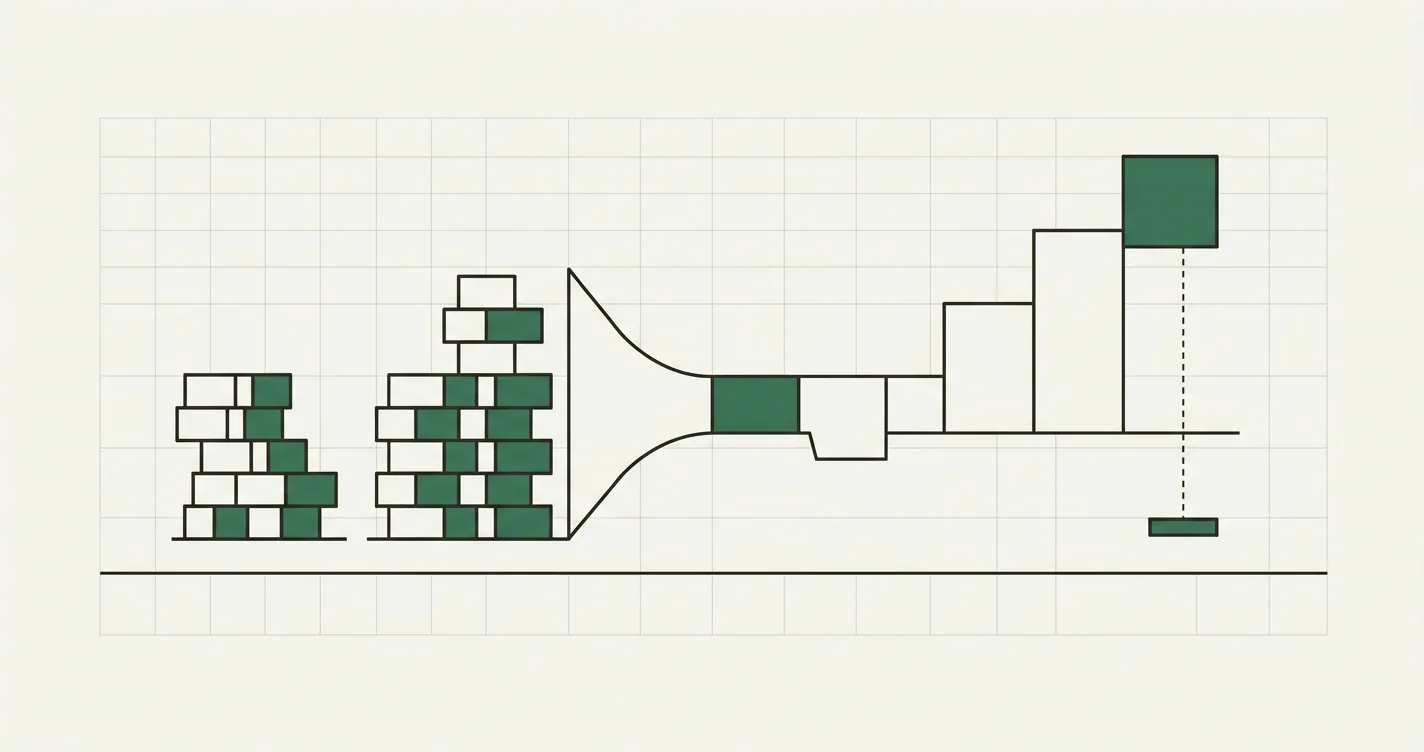
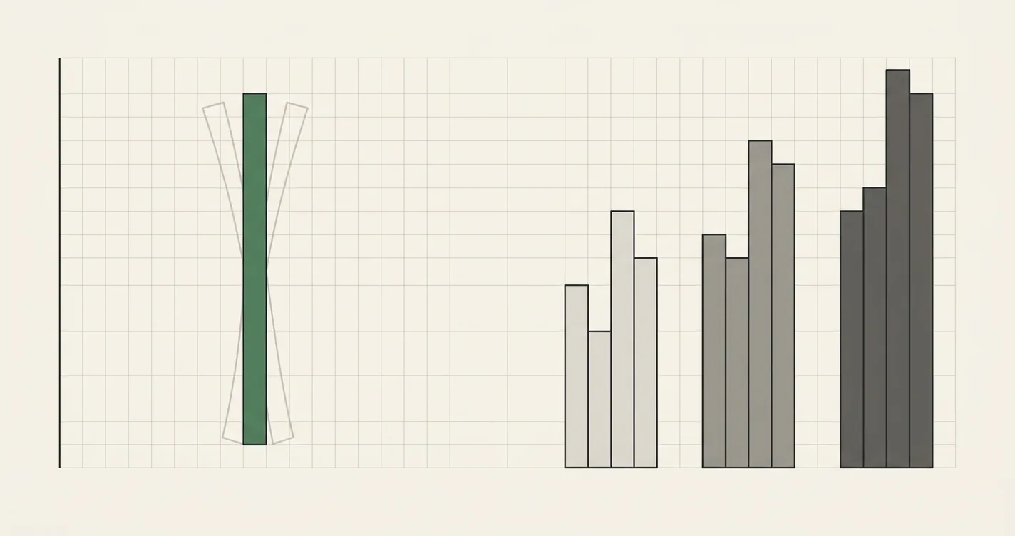
Same model, two different questions - how much does one input matter, versus what does a whole plausible future look like?
Sensitivity Analysis: How Much Does One Input Matter?
Sensitivity analysis answers a narrow, mechanical question: if this one input moves, how much does the output move? You hold every other assumption fixed at its Base-case value and flex a single driver (or two, in a two-variable table) across a plausible range. The result is a table or tornado chart that ranks which assumptions the model is most exposed to.
This is diagnostic, not narrative. A sensitivity table doesn't claim that growth will actually land at 1% or 5% - it's telling you how exposed your output is to that one input, independent of everything else. It's the tool you reach for when someone asks "which assumption should I spend the most time getting right?"
We've covered the full Excel mechanics for this - One-Variable and Two-Variable Data Tables, Goal Seek, and tornado charts - in Sensitivity Analysis in Excel. This post assumes you know roughly how a data table works and focuses on when to reach for it versus a scenario.
Scenario Analysis: What Does a Coherent Future Look Like?
Scenario analysis answers a broader, narrative question: if a specific combination of things happens together, what does the business look like? Instead of moving one driver in isolation, you move a cluster of correlated drivers at once, because in the real world they don't move independently. If a downturn cuts your growth rate, it typically also compresses gross margin (you're discounting to win deals) and pushes opex growth up (you're spending more per dollar of revenue, not less). A Downside scenario should capture all three moving together - not just one.
The output isn't a table of a thousand input combinations; it's a small, curated set of complete, internally consistent P&Ls - usually three: Base, Upside, and Downside. Each one is a full forecast in its own right, not a single output cell.
Scenario Analysis vs Sensitivity Analysis at a Glance
| Dimension | Sensitivity Analysis | Scenario Analysis |
|---|---|---|
| Variables changed | One (or two) at a time, in isolation | Several, together, as a bundle |
| Question answered | "How much does the output move if X changes?" | "What does the business look like if this whole story plays out?" |
| Correlation between drivers | Ignored - every other input stays at Base | Modeled explicitly - drivers move together in one direction |
| Typical output | A data table, tornado chart, or Goal Seek result | A small number of named, complete outcomes (Base/Upside/Downside) |
| Typical Excel tool | One/Two-Variable Data Table, Goal Seek | Parallel P&L tabs plus a CHOOSE/INDEX-MATCH toggle |
| Best for | Finding which single assumption the model is most exposed to | Communicating a credible range of outcomes to a board or investor |
| Main weakness | Doesn't capture drivers moving together in the real world | Only as good as the handful of stories you chose to model |
Neither replaces the other. A model that only has a sensitivity table can tell you the business is highly exposed to growth rate, but can't tell you what a recession actually does to EBITDA. A model that only has three scenarios can tell you the Downside case is bad, but can't tell you which of the three drivers inside it is doing the most damage.
Worked Example: Same Model, Two Different Questions
Take a simple 12-month P&L. Month 1 revenue is $500,000, growing at a monthly rate; COGS is a percentage of revenue; opex starts at $180,000/month and grows at its own monthly rate. Base case: 3% monthly revenue growth, 35% COGS, opex growing 1%/month.
Total Revenue (12mo) = Σ Revenue_m0 × (1 + g)^(m-1)  for m = 1..12
EBITDA = Total Revenue − (Total Revenue × COGS%) − Σ Opex_m
Base case result: $7.10M total revenue, $4.61M gross profit (65.0% margin), $2.28M total opex, $2.33M EBITDA (32.8% margin).
The Sensitivity Analysis Approach
To find out how exposed EBITDA is to the growth-rate assumption, hold COGS at 35% and opex at its Base path, then flex growth rate alone across a plausible range:
| Monthly Growth Rate | 1% | 2% | 3% (Base) | 4% | 5% |
|---|---|---|---|---|---|
| Total Revenue | $6.34M | $6.71M | $7.10M | $7.51M | $7.96M |
| EBITDA | $1.84M | $2.08M | $2.33M | $2.60M | $2.89M |
That's a one-variable data table. Extend it to two variables - growth rate against COGS% - and you get a full exposure map:
| Growth ↓ / COGS → | 30.0% | 32.5% | 35.0% | 37.5% | 40.0% |
|---|---|---|---|---|---|
| 1% | $2.16M | $2.00M | $1.84M | $1.68M | $1.52M |
| 2% | $2.41M | $2.24M | $2.08M | $1.91M | $1.74M |
| 3% | $2.68M | $2.51M | $2.33M | $2.15M | $1.97M |
| 4% | $2.98M | $2.79M | $2.60M | $2.41M | $2.22M |
| 5% | $3.29M | $3.09M | $2.89M | $2.69M | $2.49M |
// Two-variable data table
// Row input cell:    Assumptions!$B$7  (COGS %)
// Column input cell: Assumptions!$B$4  (Monthly Growth Rate)
// Top-left corner of the table links to the live output:
= EBITDA_Total
Every cell in that grid holds opex constant. That's the point - it isolates exactly two drivers so you can read off, cleanly, how much each one matters and where they compound.
The Scenario Analysis Approach
Now build the same model as three coherent stories instead. In a real downturn, growth doesn't just slow - margins compress at the same time (discounting to win deals) and cost discipline slips (opex grows faster, not slower). A scenario has to move all three together:
| Driver | Downside | Base | Upside |
|---|---|---|---|
| Monthly revenue growth | 1% | 3% | 5% |
| COGS % of revenue | 40% | 35% | 32% |
| Monthly opex growth | 2% | 1% | 0.5% |
Run the same 12-month model three times, once per scenario:
| Metric | Downside | Base | Upside |
|---|---|---|---|
| Total Revenue (12mo) | $6.34M | $7.10M | $7.96M |
| Gross Profit | $3.80M | $4.61M | $5.41M |
| Gross Margin % | 60.0% | 65.0% | 68.0% |
| Total Opex | $2.41M | $2.28M | $2.22M |
| EBITDA | $1.39M | $2.33M | $3.19M |
| EBITDA Margin % | 21.9% | 32.8% | 40.1% |
| Δ EBITDA vs Base | −$0.94M (−40.3%) | - | +$0.86M (+37.0%) |
Compare the Downside case here ($1.39M EBITDA) to the sensitivity table's worst single cell at 1% growth / 40% COGS ($1.52M) - the scenario is worse, because it also drags opex growth up to 2%, a third lever the two-variable data table didn't touch. That's the structural difference in one number: sensitivity analysis under-states the Downside because it never lets all the bad things happen at once.
Building a Scenario Toggle in Excel
Once you have three parallel P&L builds (say, on Base_PL, Upside_PL, and Downside_PL tabs sharing an identical row layout), a Comparison sheet pulls whichever one is "live" via a single selector cell:
// Comparison sheet: pull the active scenario's EBITDA based on a Scenario_Selector cell (1, 2, or 3)
= CHOOSE(Scenario_Selector, Base_PL!$C$20, Upside_PL!$C$20, Downside_PL!$C$20)
Because each scenario tab is a full, independent P&L rather than a single flexed cell, you can also show all three side-by-side permanently - which is usually more useful for a board pack than a toggle, since the reader can see the range at a glance instead of clicking through one case at a time. The full mechanics of CHOOSE versus INDEX/MATCH toggles are covered in Sensitivity Analysis in Excel - the same toggle pattern works whether you're flexing a single sensitivity input or an entire scenario.
When to Use Each (and When to Use Both)
- Use sensitivity analysis when you need to know which single assumption the model is most exposed to - before you've decided which scenarios are even worth building. It's the right first step: run a tornado chart, find the two or three drivers with the biggest swing, and build your scenarios around those.
- Use scenario analysis when you need to communicate a range of coherent outcomes to someone who has to make a decision - a lender, a board, an investor. "EBITDA ranges from $1.4M to $3.2M depending on which of three plausible futures plays out" is a sentence a decision-maker can act on. "EBITDA is $X per 1% of growth" is not.
- Use both, in sequence, on the same model. Run sensitivity first to identify which two or three drivers actually move the needle. Build your Base/Upside/Downside scenarios around exactly those drivers, moving them together in the direction a real Upside or Downside would push them. Anything the sensitivity pass showed to be immaterial doesn't need its own scenario lever - hold it at Base and simplify the model.
Common Mistakes
- Calling a sensitivity table a "scenario." If only one input moved, it's a sensitivity - not a Downside case. Label it accurately, or the reader will assume the other risks were modeled too.
- Moving drivers in a scenario independently instead of together. A Downside scenario with slower growth but unchanged margins isn't a real downside - margins move too. Pressure-test the direction of every driver against the story you're telling.
- Building too many scenarios. Five or six named cases dilute the message. Base, Upside, Downside is almost always enough; more than that and the reader can't hold the comparison in their head.
- Skipping sensitivity analysis before picking scenario drivers. Without it, you're guessing at which two or three assumptions matter enough to flex in a scenario - and likely wasting scenario slots on drivers with negligible impact.
- Presenting a two-variable sensitivity table as the Downside case. A grid that holds opex fixed while flexing growth and COGS will always be more optimistic than a scenario that also lets opex slip - don't let a sensitivity output stand in for a real scenario.
- No single source of truth for the "live" case. If the Base/Upside/Downside tabs don't feed a common Comparison sheet via a selector, it's easy for a stale scenario to get referenced elsewhere in the model.

Alex Tapio
Founder of Finamodel • Professional Financial Modeller • Ex-Deloitte