How to Build a Board Reporting Template in Excel
Key Takeaways
- Actuals go in one place - the KPI matrix - and nowhere else. Every other sheet (MoM, YoY, dashboard) should be a formula referencing that matrix, not a second place to type numbers.
- 10-12 KPIs across growth, profitability, cash, and unit economics is the right ceiling. More than that turns a decision tool into a data dump.
- Show MoM and YoY together. MoM catches short-term inflections; YoY strips out seasonality and shows the real trajectory. Neither alone is sufficient.
- Traffic-light status should be formula-driven against thresholds set once per year from the board-approved plan - not adjusted after the fact to flatter a bad month.
- Consistency beats sophistication. A board that sees the same KPI set, the same layout, and the same cadence every month can spot a trend in seconds; a package that changes shape each cycle forces re-orientation instead of decisions.
- Reconcile definitions annually, not mid-year. Changing how a KPI is calculated partway through the year breaks every trend line built on it.
Once the KPI matrix is running, track plan against actuals in more depth with a budget vs. actual analysis, and see how the underlying numbers get forecast in the first place in our guide to financial forecasting methods.
A board reporting template turns a scramble to assemble slides the night before a board meeting into a repeatable, five-minute drop-in of actuals. This guide walks through how to structure a board reporting package: which KPIs belong in it, how to build month-on-month and year-on-year variance formulas, how to set traffic-light status thresholds, a full worked example with real numbers, and the mistakes that make board packages unreliable or ignored.
Most finance teams over-build or under-build their board reporting. Over-built packages sprawl into 40-tab dashboards that take two days to update every month and that no director reads past page two. Under-built packages are a single screenshot of the P&L pasted into a deck, with no trend, no variance, and no way for a board member to tell whether a number is good or bad without asking. The fix is the same one that works for any recurring financial report: a small, fixed set of KPIs, tracked consistently over time, with the comparison work - MoM, YoY, status - done by formula instead of by hand every month.
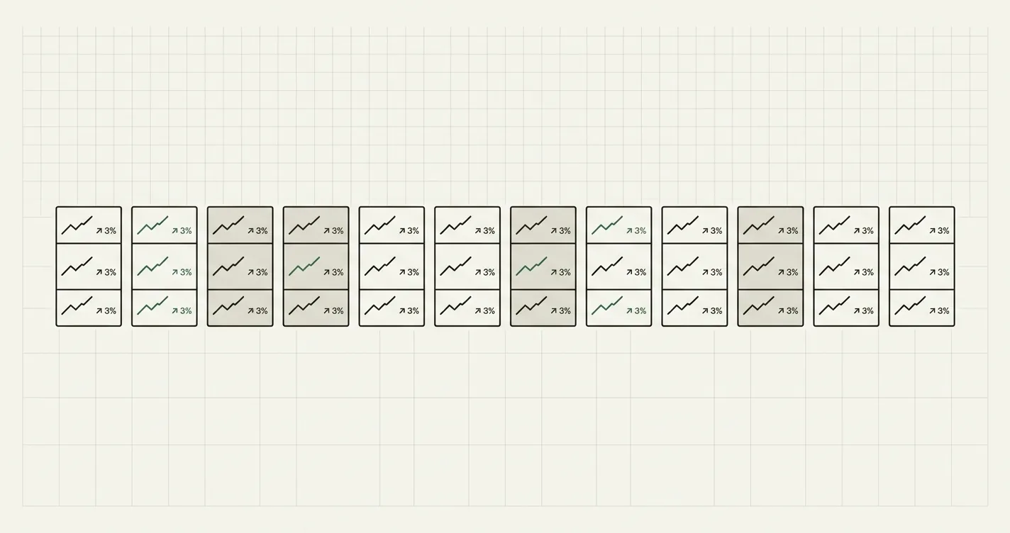
From monthly actuals to a one-page board dashboard: the KPI matrix feeds both variance views, which roll up into status-flagged board reporting.
Structuring the Template
A board reporting package that survives more than two board cycles is built in layers, each doing one job:
- KPI matrix: A rolling window (typically 24 months) of actuals for every tracked metric, one row per KPI, one column per month. This is the single source of truth - everything else references it.
- MoM sheet: Month-on-month dollar and percent change for every KPI, in the same row layout as the KPI matrix, so each delta traces back to two adjacent cells.
- YoY sheet: Year-on-year dollar and percent change across the trailing 12 months, same layout again.
- Dashboard: A one-page rollup - latest month, MoM%, YoY%, YTD current, YTD prior, YTD growth%, and a traffic-light status column - condensed enough to read in the board meeting itself.
The discipline that makes this work: actuals are typed in once, on the KPI matrix, and nowhere else. Every other sheet is a formula referencing that matrix. If you paste a number directly onto the dashboard instead of computing it from the matrix, the two will eventually disagree, and nobody will notice until a board member asks why the deck and the dashboard don't match.
Choosing the KPI Set
Most board packages fail by including too many metrics, not too few. A useful ceiling is 10-12 KPIs spanning four categories:
| Category | Example KPIs |
|---|---|
| Growth | Revenue, new customers |
| Profitability | Gross profit, EBITDA |
| Cash | Operating cash flow, cash balance |
| Unit economics | Active customers, churned customers, ARPU, CAC |
| Operations | Headcount |
A standard baseline - revenue, gross profit, EBITDA, operating cash flow, active customers, new customers, churned customers, ARPU, CAC, and headcount - covers growth, margin, cash, and unit economics in ten lines. Add or swap metrics to match what actually drives your board's decisions: a marketplace might add GMV or take rate; a services firm might swap CAC for billable utilization. The test for whether a KPI belongs is simple - if a director wouldn't ask a follow-up question when it moves, it doesn't need a row.
Month-on-Month and Year-on-Year Formulas
Both variance views use the same two formulas, applied to different column pairs:
// Month-on-month dollar change
= CurrentMonth - PriorMonth

// Month-on-month percent change
= (CurrentMonth - PriorMonth) / PriorMonth

// Year-on-year dollar change (12 columns back)
= CurrentMonth - SameMonthLastYear

// Year-on-year percent change
= (CurrentMonth - SameMonthLastYear) / SameMonthLastYear
MoM catches short-term inflections - a sudden drop in new customers, a spike in CAC - but is noisy for seasonal businesses. YoY strips out seasonality and is the better read on underlying trajectory. A package that only shows MoM can look fine every month while the YoY trend quietly deteriorates; show both, side by side, for every KPI.
Worked Example: A Five-KPI Board Snapshot
Here's a worked month for a growth-stage SaaS company reporting March actuals against February (MoM) and against March of the prior year (YoY):
| KPI | Feb (Prior Mo) | Mar (Current) | MoM $ | MoM % | Mar Last Year | YoY $ | YoY % |
|---|---|---|---|---|---|---|---|
| Revenue | $840,000 | $902,000 | +$62,000 | +7.4% | $610,000 | +$292,000 | +47.9% |
| Gross Profit | $630,000 | $676,500 | +$46,500 | +7.4% | $445,300 | +$231,200 | +51.9% |
| EBITDA | $92,400 | $108,240 | +$15,840 | +17.1% | $30,500 | +$77,740 | +254.9% |
| Active Customers | 1,240 | 1,289 | +49 | +4.0% | 890 | +399 | +44.8% |
| CAC ($) | $1,850 | $1,790 | -$60 | -3.2% | $2,120 | -$330 | -15.6% |
Reading this row by row: revenue grew a healthy 7.4% MoM and nearly 48% YoY - no seasonality distortion, this is real compounding. EBITDA's 254.9% YoY jump looks dramatic but starts from a thin $30.5K base, a reminder to check the denominator before reacting to a large percentage move. CAC falling both MoM and YoY is a genuinely good signal worth a line in the board narrative, since falling acquisition cost alongside customer growth suggests improving unit economics, not just spend cuts.
Traffic-Light Status and the One-Page Dashboard
The dashboard sheet condenses the KPI matrix into seven columns per metric: latest month, MoM%, YoY%, YTD current, YTD prior, YTD growth%, and a status flag. Status is computed, not judged by hand, against thresholds set once per year from the annual plan:
// Traffic-light status based on YTD growth %
= IF(YTD_Growth >= Green_Threshold, "On track",
    IF(YTD_Growth >= Amber_Threshold, "Watch", "Off track"))
Using a 25% green / 10% amber threshold pair (common for a growth-stage plan) against the worked example above:
| KPI | YTD Growth % | Threshold Check | Status |
|---|---|---|---|
| Revenue | +47.9% | ≥ 25% | On track |
| Gross Profit | +51.9% | ≥ 25% | On track |
| EBITDA | +254.9% | ≥ 25% | On track |
| Active Customers | +44.8% | ≥ 25% | On track |
| CAC | -15.6% (lower is better) | ≤ Plan CAC | On track |
Set thresholds once at the start of the fiscal year, tied to the board-approved plan, and leave them alone. Moving the amber threshold from 10% to 5% in a slow month to avoid a red flag defeats the entire purpose of a status system and is the fastest way to lose a board's trust in the reporting.
Common Mistakes to Avoid
- Tracking too many KPIs. Past 12-15 metrics, a board package becomes a data dump. If a metric wouldn't prompt a follow-up question when it moves, cut it.
- Typing derived figures by hand instead of formula-driving them. MoM%, YoY%, and status should all be formulas referencing the KPI matrix. Manual entry means the dashboard and the underlying actuals will eventually drift apart.
- Showing MoM without YoY (or vice versa). MoM alone hides seasonal deterioration that looks fine month-to-month; YoY alone hides a sudden recent inflection. Show both.
- Moving thresholds to avoid a red flag. Adjusting the traffic-light bar after a bad month to make it look green defeats the system's purpose and damages board trust once discovered.
- Inconsistent KPI definitions month to month. If "active customers" is defined one way in January and a slightly different way in June (e.g., a churn-window change), every trend line built on it becomes misleading. Lock definitions at the start of the year.
- Rebuilding the format every cycle. A board that has to re-orient to a new layout each meeting spends its limited time parsing structure instead of discussing the business. Keep the shape identical; only the numbers should change.

Alex Tapio
Founder of Finamodel • Professional Financial Modeller • Ex-Deloitte